There is a flaw here. Sometimes the penultimate population could have been less than maximum population, which would have changed the result slightly. That did not happen except for the smallest population here.
The null hypothesis:
I have already described the computer program and the prediction it makes. What I shall now do is to present the null hypothesis. What the data should look like were I wrong and everybody else right. Below is the curve you get if there is no kin recognition, only recessive lethal mutations. The parameters entered are:
10 simulations averaged.
Populations followed to extinction or to 1,000 generations.
Maximum of 6 offspring per couple.
Initial population 100.
Maximum population, tracked on the x axis, limited by eliminating offspring at random as necessary. (Number of offspring per individual in the maximum population in the final generation [minus one to replace that individual] tracked on the y axis.)
100 gene pairs subject to recessive lethal mutations.
10 mutations per site per 100,000 generations.
0 gene pairs subject to detuning mutations. (In fact it amounts to 200 per chromosome.)
0 mutations per site per 100,000 generations.
0 one thousandths of one offspring lost at meiosis per unit of detuning.
No populations were added from saved files.
Ten populations were run. Their final populations were added. Then the sum was divided by 10, then by the maximum population size for that set of runs to get average birth rate per individual.
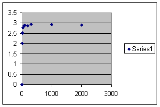
Population sizes followed by the number of offspring in generation 1,000 were:
3: 0, 0, 0, 0, 0, 0, 0, 0, 0, 0.
10: 18, 11, 25, 30, 16, 14, 30, 26, 18, 13.
20: 60, 39, 25, 56, 58, 60, 60, 60, 27, 58.
30: 88, 86, 83, 89, 98, 80, 90, 90, 88, 41.
60: 178, 179, 172, 164, 180, 178, 174, 160, 164, 178.
100: 295, 293, 277, 297, 286, 283, 295, 291, 292, 290.
200: 586, 473, 582, 580, 593, 594, 582, 585, 584, 580.
300: 873, 868, 876, 891, 881, 876, 873, 864, 889, 891.
1,000: 2,939, 2,951, 2,933, 2,918, 2,900, 2,895, 2,935, 2,869, 2,939, 2,902.
2,000: 5,844, 5,847, 5,766, 5,794, 5,886, 5,853, 5,816, 5,861, 5,757, 5,804.
The calculations are as follows:
Size |
sum |
average |
Offspring per member |
3 |
0 |
0 |
0 |
10 |
201 |
20.1 |
2.01 |
20 |
503 |
50.3 |
2.52 |
30 |
833 |
83.3 |
2.78 |
60 |
1,927 |
192.7 |
2.88 |
100 |
2,899 |
289.9 |
2.90 |
200 |
5,739 |
573.9 |
2.87 |
300 |
8,788 |
878.8 |
2.93 |
1,000 |
29,181 |
2,918.1 |
2.92 |
2,000 |
58,028 |
5,802.8 |
2.90 |
And here is the graph. Vertical axis is offspring per member in the last generation. Horizontal axis is maximum population size.
There is a flaw here. Sometimes the penultimate population could have been less than maximum population, which would have changed the result slightly. That did not happen except for the smallest population here.
So there is what you have always been told. The bigger the population the better. But I propose that there is some sort of kin recognition. Here is an identical set of runs except that kin recognition has been turned on.
Maximum population is given followed by the number of offspring in the final generation for 10 runs.
3: 0, 0, 0, 0, 0, 0, 0, 0, 0, 0.
10: 24, 27, 0, 27, 0, 26, 0, 0, 0, 0.
20: 42, 45. 41. 46. 0. 0. 41. 0. 42. 0.
30: 0, 0, 46, 68, 58, 54, 64, 56, 0, 64.
60: 105, 0, 106, 118, 129, 119, 105, 114, 122, 121.
100: 188, 174, 188, 137, 219, 158, 174, 176, 142, 165.
200: 320, 306, 339, 303, 315, 307, 350, 352, 281, 232.
300: 495, 451, 462, 456, 376, 478, 359. 389, 298, 408.
1,000: 0, 0, 324, 623, 1,351, 1,125, 0, 0, 1,120, 1,258.
2,000: 0, 0, 0, 2,192, 345, 2,026, 0, 2,540, 2,421, 2,251.
The ten runs at each population size were added, divided by 10 for an average and then divided by the maximum population size. Calculations are as follows:
Size |
sum |
average |
Offspring per member |
3 |
0 |
0 |
0 |
10 |
104 |
10.4 |
1.04 |
20 |
257 |
25.7 |
1.29 |
30 |
410 |
41.0 |
1.37 |
60 |
1,039 |
103.9 |
1.73 |
100 |
1,721 |
172.1 |
1.72 |
200 |
3,105 |
310.5 |
1.55 |
300 |
4,172 |
417.2 |
1.39 |
1,000 |
5,108 |
510.8 |
.580 |
2,000 |
11,774 |
1,177.4 |
.587 |
Then that is graphed as before with the number of offspring per member of population in the final generation on the vertical axis and population size on the horizontal. The same caveat applies that occasionally the penultimate population is less than maximum population. This introduces a small error. Here is the graph:
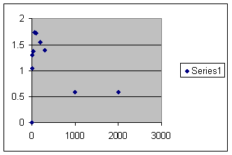
Obviously this is different from the previous graph. Now the fertility rises rapidly to a maximum, falls almost as rapidly and tends to level off below replacement. I am telling you this is what goes on in real life. If you appeal to authority, I am dead wrong. How ever if you appeal to evidence, compare with a chart we have seen before showing the experience with field counts of wild animals.
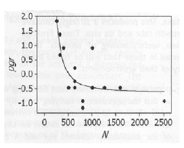
Graph is from On the Regulation of Populations of Mammals, Birds, Fish and Insects, Richard M. Sibly, Daniel Barker, Michael C. Denham, Jim Hope and Mark Pagel SCIENCE vol. 309 July 22, 2005 page 609. Vertical axis is growth rate. Horizontal axis is population size. Inbreeding depression is not demonstrated, but we know it exists. The two graphs agree exquisitely and are in total contrast with the null hypothesis.
If others disagree they are in flagrant disregard of the facts.
There have been 4,077 visitors so far.